I’m certain you all looked at climate graphs a lot in your professional career and tried to make sense of what you see. We now want to use Calc or Excel to get to know your gallery climate and make decisions about trigger values for an alarm system. Yes, at the moment our logger is just a dumb device that sits in the corner and registers what happens. But we can tell it to blink a warning with its LEDs when a climate value is not okay, we can give it a piezo speaker so it can ring a warning tone or we can build another logger who is able to send warning messages via WiFi. But you might remember Aesop’s boy who cried wolf? Yep, if alarms come too frequently and for no serious reasons we tend to ignore them. That’s why we first have to understand what is usual and unusual behavior of our room climate by analyzing our graphs.
The problem with fixed trigger values
Most devices with an alarm function allow to set up an alarm when the temperature or humidity is above or beyond a certain value. Good professional devices allow to decide how many times a reading has to be beyond or above this value to trigger an alarm, avoiding alarms caused by only minor trespasses or simple false readings of a sensor.
This is good for institutions with a relatively stable climate like it is provided by a HVAC system. Here we can set an alarm if the temperature falls beyond 19 °C (66 °F) or rises above 22 °C (71 °F) and we can define a slightly broader range for our relative humidity, probably circling around 55%. But if you are still reading an article series that deals with building your own data logger you probably don’t have this ideal setting.
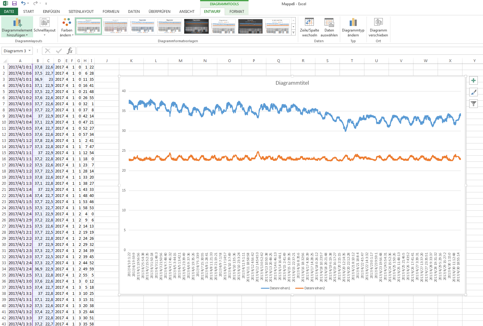
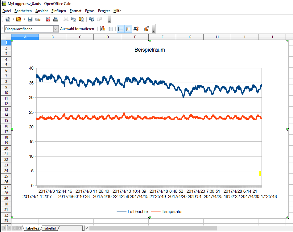
More likely (museum studies students, brace yourself, here comes a real-life graph) it will look like this:
A real-life graph with usual and unusual climate swings.
It’s not that this climate is not problematic. But there are problematic things happening and there are a lot of things happening that are just “normal” for this not-so-ideal storage room. For example, the temperature climbing from 17 °C to 23 °C (62 to 73 °F) in some up-and-down waves during May is pretty normal. A trigger warning at 22 °C (71 °F) would be pretty useless as the room has only a heating device.
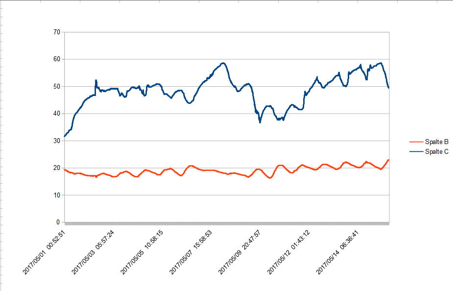
On May 2nd, there is a sudden jump in relative humidity within just 35 minutes:
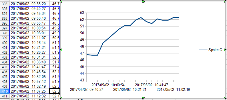
A sudden rise of relative humidity from under 47% to over 52% within 35 minutes.
Ironically, a standard humidity alarm would probably stop alarming as this happens, because the humidity goes from a value that is not so ideal in theory into a range that is widely regarded as ideal. But as the collections manager of a not-so-ideal setting this occurence is definitely out of the normal behavior of the room. Someone might have left the door open, allowing wet air to come in. You want to check what’s wrong there. But how will you know?
A warning of sudden changes
We need a more flexible warning system, one that sends us a warning when sudden changes in humidity and/or temperature take place. One simple way to do this is to subtract the current measurement from the previous measurement. We get a value that tells us something about the change in the timespan we set between our measurements.
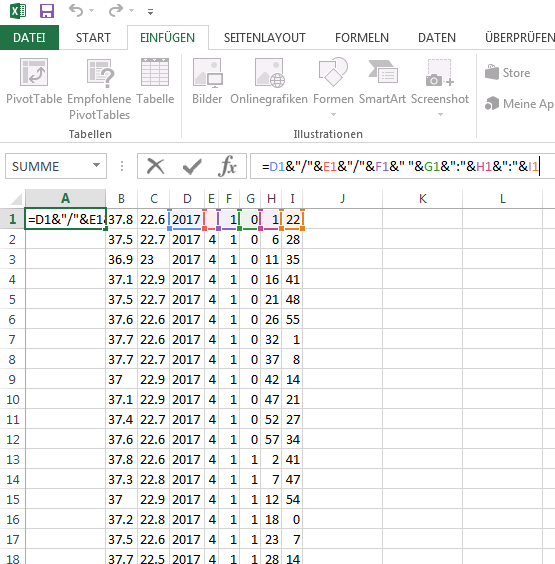
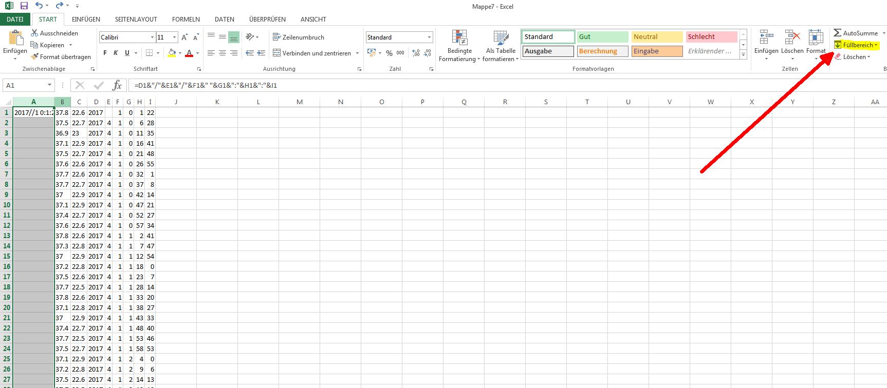
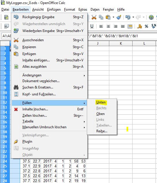
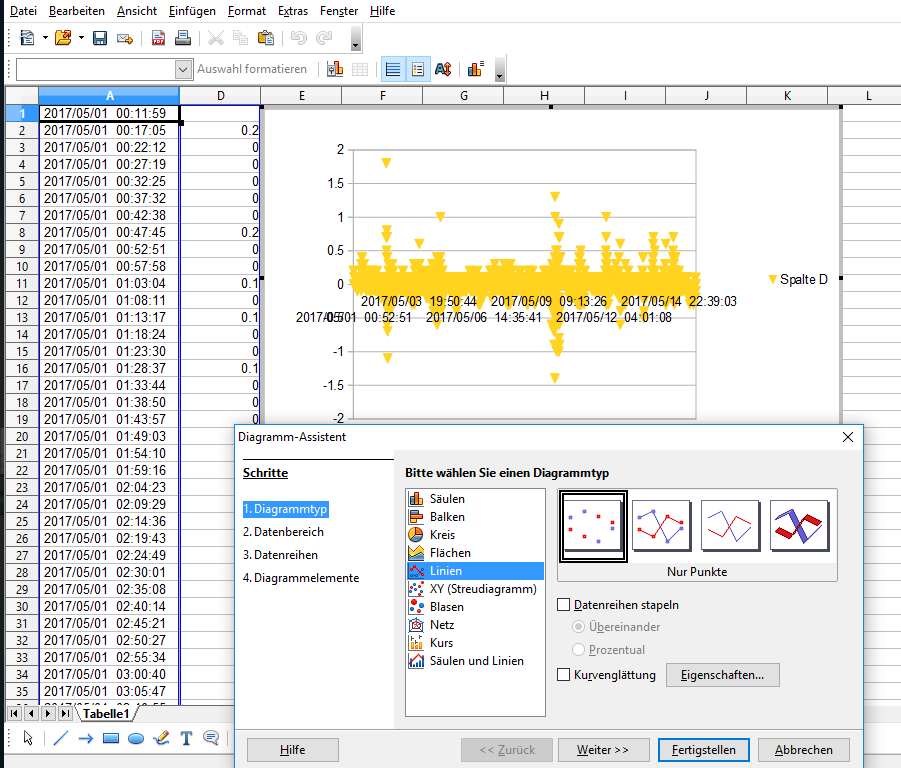
With our knowledge from the previous article on using Calc you should now be able to write a formula that subtracts the second humidity measurement from the first (Hint: the formula is “=C2-C1”) and apply it to all values of the column with the “fill” function. It’s pretty similar in Excel, by the way.

Subtracting a humidity value from the previous value.
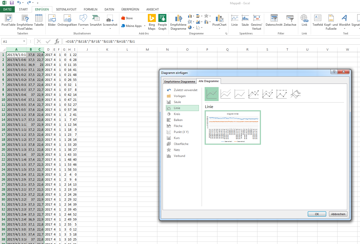
We get a column with values that tell us something about change over time. It is now easy to make a diagramm that lets us see what values are widely off the mark. Hint: you can hide the columns you don’t need in your diagramm before you mark the columns you do need. Maybe this time we choose points instead of lines:
A diagramm of changes.
While you could deduct the dramatic changes from the original graph, this new graph gives you a better overview and a handle to define about which changes you really want to get notified. You see that everything below 1 is probably pretty normal and would produce too many warnings if you set the trigger there. Everything above 1 is probably something you would like to know about immediately, not just when the monthly climate report arrives.
In real life we have used this for fine-tuning our climate warnings at the TECHNOSEUM. There are areas with well-known climate swings and some that need closer attention. For most areas, I get a warning email when a temperature or humidity change is over 1 degree within 5 minutes. If it is over 3 degrees other colleagues responsible for that area get a warning email. This keeps me aware of a lot of changes and I can look at the graphs to decide whether to check or call a colleague, while the other colleagues stay unbothered most of the time, but can check immediately if something goes very wrong.
The slow, steady, evil change
This is good, but it doesn’t warn you about another thing that creeps a collections manager out: The slow and steady change of a failed heating or a water leak. To show you what I mean, let’s take a look at another real-life graph:
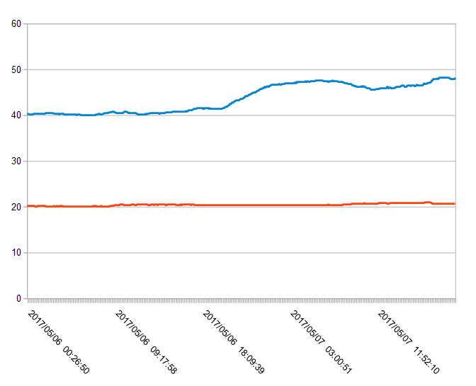
A slow and steady rise in humidity.
The room has a rather stable climate at about 40% relative humidity. At about 8 p.m. humidity starts rising. Slowly, but steadily until it reaches 46,7% at about 1:30 a.m the next morning. Nothing our warning system would have warned us about, because the changes between two humidity values are minor. If we want to implement a warning system for this kind of changes, we need something else. We need a warning for problematic tendencies.
How can we do this? We first need to define a timespan we want to take as the basis of our calculations. Let’s take 30 minutes. If we count the differences between the 6 last values and divide it by 5, we get a value for the tendency. By now, you should be able to build the formular for this yourself. It is:
=(C2-C1)+(C3-C2)+(C4-C3)+(C5-C4)+(C6-C5)/5
(If C is your column with humidity values.)
By making a diagramm out of it and comparing it with our original curve, we get an idea how the problematic changes look like:
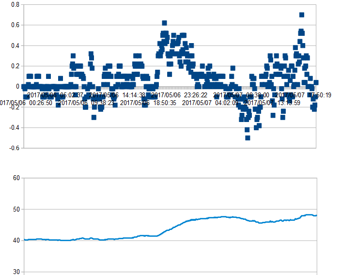
The tendency values compared to the original curve.
We can now assume that getting a warning if the tendency shows a value over 0.5 would be a good idea. But, much more than with the value for rapid change, this is highly dependend on your setup and might be different from monitored space to monitored space. There might be some less-than-ideal storage areas where you can’t use it at all, because rise and fall of humidity and temperature is simply normal, and there’s nothing you can do about it. Let’s do a test so it becomes clear what I mean…
Bringing it all together
When we look again at the first 3 days of our scary graph above (you can download all the values here), how would our warning system react?

3 days in May…
Our first trigger warning comes on the 1st of May at about 8 a.m. when the constantly rising tendency in humidity first passes the 0.5 mark. This trigger value is met a couple of times throughout the morning, so there would be plenty of time to check an react.
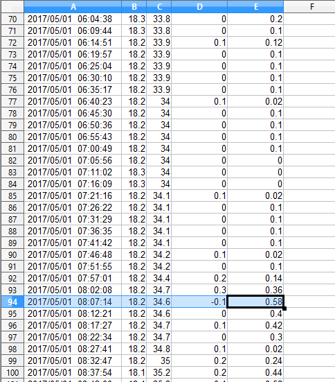
First trigger warning comes in 8:07 on May 1st.
Our next warning comes a day later at about 10 o’clock. This time it’s a warning of sudden change. We can see the sudden change warning triggering before the tendency warning follows suit 5 minutes later:
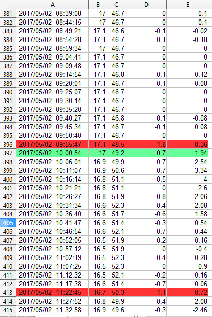
Sudden change warning and tendency warning on May 2nd.
About 1 1/2 hours later we see a rapid decrease and some more tendency warnings as humidity goes back to “normal”.
We see again a rising tendency (although not as long enduring as the one May 1st) at about 4:30 p.m. that day, the next at about 10:30 a.m. the following day, next at 1 p.m., next at 8 p.m.

7 warnings in 3 days.
In the timespan of only 3 days our tendency warnings came in 7 times. Warning of sudden change came in 2 times. A warning for a fixed value… well if we would have defined a fixed warning when the humidity rises above 40% we would have gotten a constant warning starting at about 1 p.m. on May 1st – 5 hours after our tendency warning kicked in.
If this graph came from a climate controlled storage area I certainly wanted to get all 7 tendency warnings, because, seriously, this is NOT a good graph! I probably even set my tendency warnings as low as 0.2 or 0.3. For a well known not-so-ideal storage area, well, the warning for sudden changes will do. I won’t change German weather but I sure want to catch leaking ceiling windows or gates left open in wet weather.
I hope you had fun with this little analysis of data. I did. We might like to improve our logger on the basis of these findings…
Read the other posts for this project:
- Build Your Own Data Logger – Investigating Your Climate Graphs
- Build Your Own Data Logger – We Want Fahrenheit!
- Build Your Own Data Logger – Processing Data With Microsoft Excel
- Build Your Own Data Logger – Processing Data with OpenOffice Calc
- Build Your Own Data Logger – The Software, Telling the Logger to Log
- Build Your Own Data Logger – Arduino, the Datalogger-Shield and the Wiring
- Build Your Own Data Logger – The Sensor, Heart of the Logger
- Build Your Own Data Logger – Quick Start Guide