Collecting data is nice, but not a value in itself. We collect data with our logger to actually do something with it. To process our data further I will use OpenOffice Calc by Apache (https://www.openoffice.org/product/index.html). Why Calc and not Excel? Various reasons: it’s free, it’s open source, it’s available for Windows, Linux and Mac and, most important, it is very user friendly for processing data. It beats Excel on many fields, at least in my opinion (I will follow up with an Excel part of this, though).
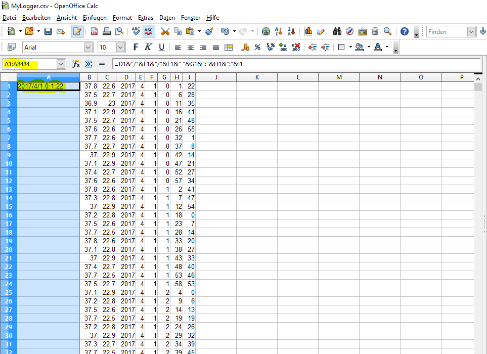
So, now we have made a software that saved our climate data as “MyLogger.csv” on our SD card. Next up we will save it from the SD card to our computer and open it with OpenOffice Calc. You should get something that looks like this:
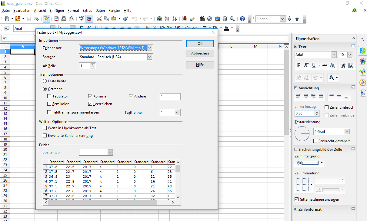
Yours might be in English, though. Basically the program suggests to make a spreadsheet out of your comma separated values using the comma as marker for the columns – which is exactly what we need. If you used different separators, you can adjust this in this dialogue. Once you are satisfied with how the preview looks you hit “OK”.
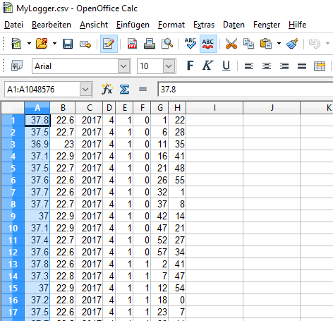
While we could make a graph for temperature and humidity right there and then, it’s probably better to have our date and time in a format we can use. We could have fixed this in our software already – but nobody is perfect, we just note this for our improvements. For now, we just add another column to our spreadsheet: we mark our column A and choose “Insert”–>Column. A new column A appears on the left of our original column, which is now “B”.
Now we will make a nice, new date and time out of this snipplets we got in column D to I. We want our timestamp to look like this: “2017/4/1 0:1:22″To do that, we combine the data from the colums with a formula, which means we put our cursor in A1 and type “=” which indicates the beginning of a formula. Then we type in the first field “D1”, place an “&”to join it with the next piece we need, which is a “/”. We type that in quotation marks because otherwise our software will interprete the / as a division. We add the next field, which is E1, with & and so on. After 6 fields, two “/”s, a blank and two “:” we have:
=D1&”/”&E1&”/”&F1&” “&G1&”:”&H1&”:”&I1
When we hit enter, we should see a nice, clean time stamp in A1:
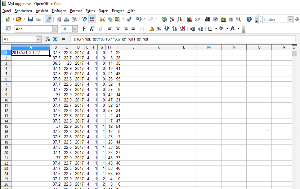
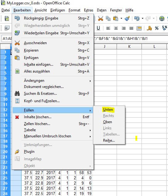
We want this in all our A columns, right? But we first have to see how many rows of data we have, so we look into our last row, which is in this case the 8484, yours might be different. We now go to the address field, write “A1:A8484” and hit enter. This tells our Calc that we want to do something in all A fields from A1 to A8484. That’s why these are marked now.
Now comes the trick. From the “Edit” menu we choose the “fill” option and choose “down”. Now all our data sets have a nice time stamp made from columns D to I.
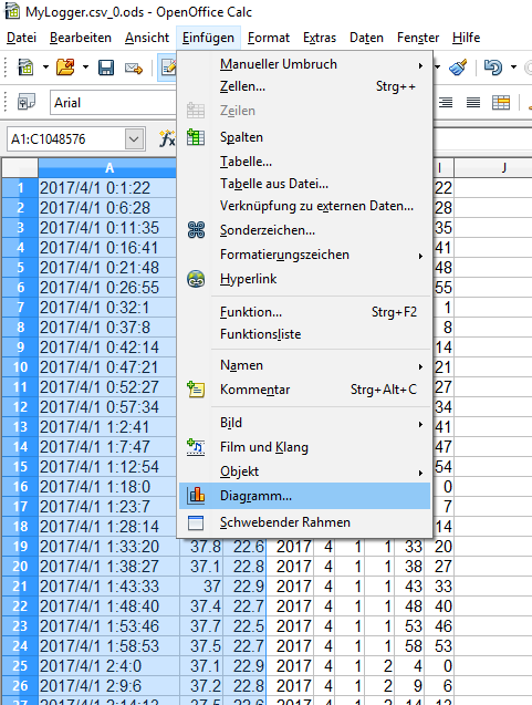
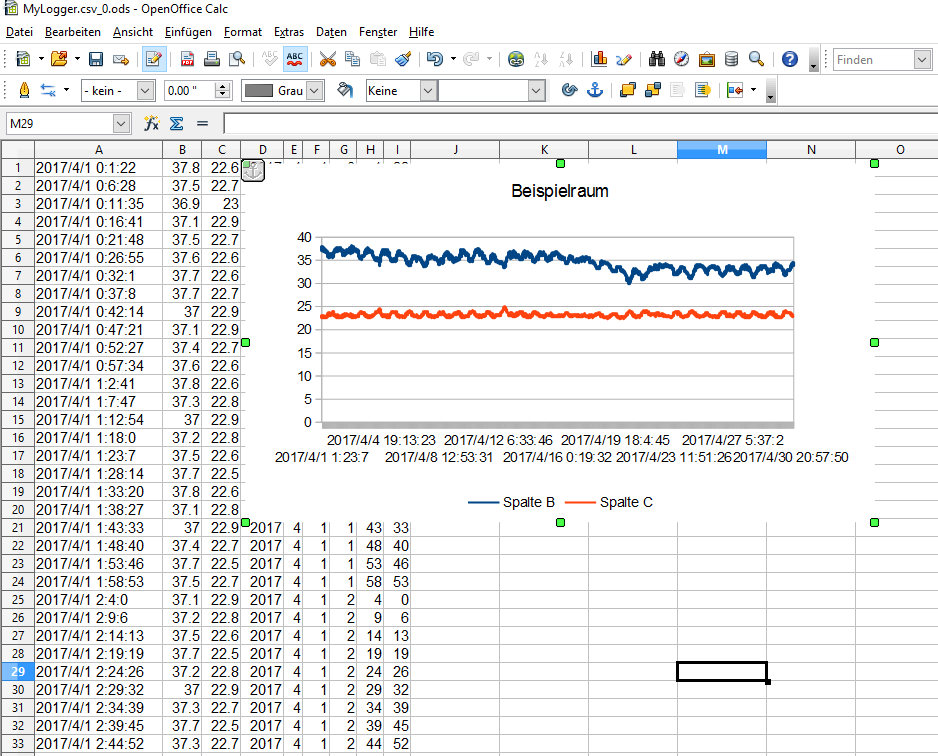
Ready to have a nice diagramm? Okay, here we go. You first mark the colums A to C which hold all the data we want to see in our graph. Then we choose the diagramm option from the “Insert” menu:
For the diagramm type we choose “lines”. In the background we already get an idea of how our graph will look like.
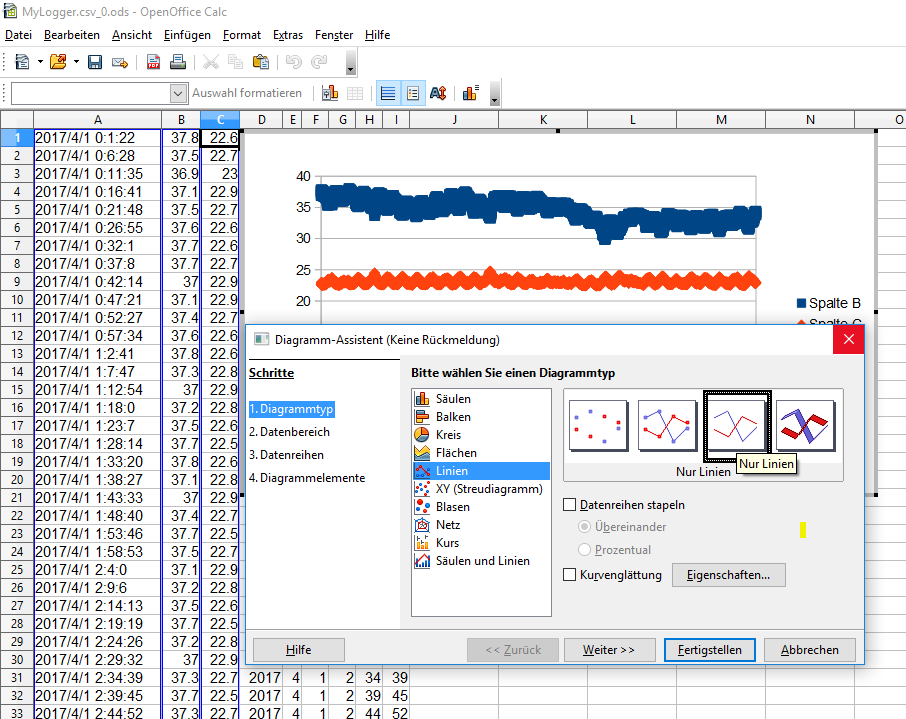
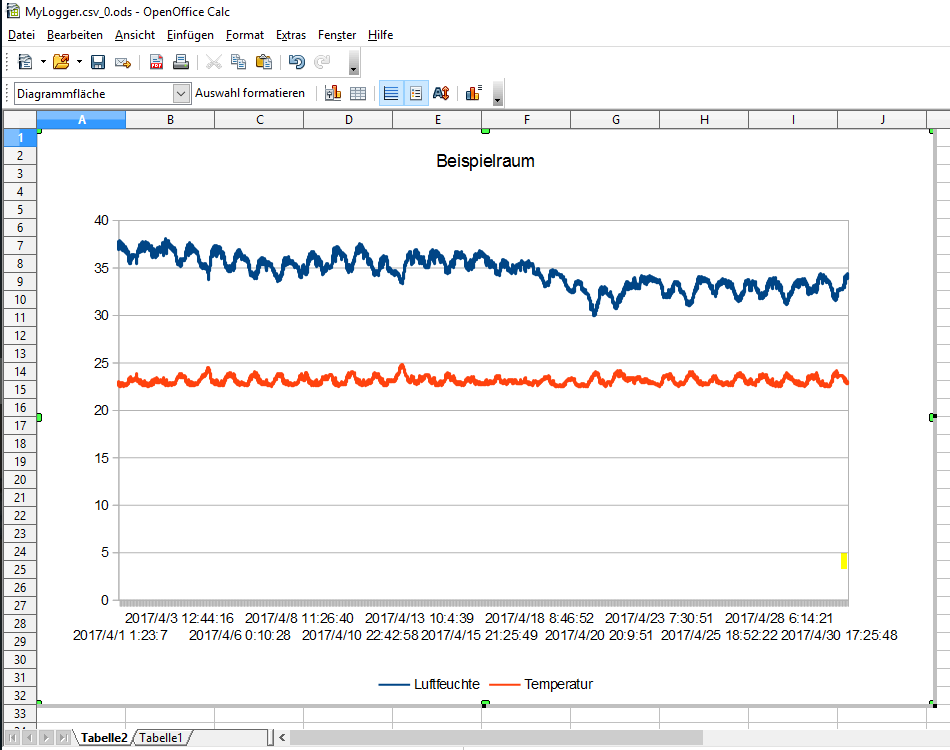
We can now hit “finish” or do some adjustments like giving our diagramm a title. As soon as we hit “finish” we have a graph that we can drag around, enhance and even cut out and paste in a new spreadsheet, just as we please.
With all the Calc knowledge we gained now, we will next up tweak our data the way we want it. Like: Those temperatures are in Celsius and we want them in Fahrenheit. But first, we will do the same in Microsoft Excel, for those who feel more comfortable with this…
Read the other posts for this project:
- Build Your Own Data Logger – Investigating Your Climate Graphs
- Build Your Own Data Logger – We Want Fahrenheit!
- Build Your Own Data Logger – Processing Data With Microsoft Excel
- Build Your Own Data Logger – Processing Data with OpenOffice Calc
- Build Your Own Data Logger – The Software, Telling the Logger to Log
- Build Your Own Data Logger – Arduino, the Datalogger-Shield and the Wiring
- Build Your Own Data Logger – The Sensor, Heart of the Logger
- Build Your Own Data Logger – Quick Start Guide